Gallup’s Easily Misunderstood Health Insurance Survey is Out
For many months, I have struggled with the Gallup-Healthways survey of health insurance, which I criticized in a previous entry. Of all the surveys of health insurance it is the least informative, and I wish the Gallup folks would give their results better context. Unfortunately, because it is the timeliest, the media get excited about it, especially since Obamacare started.
The latest survey, which covers the 4th quarter of 2014, reported that the “uninsured rake sinks to 12.9 percent”. Just look at the graph: What a nosedive in the number of uninsured Americans! Well, not so fast.
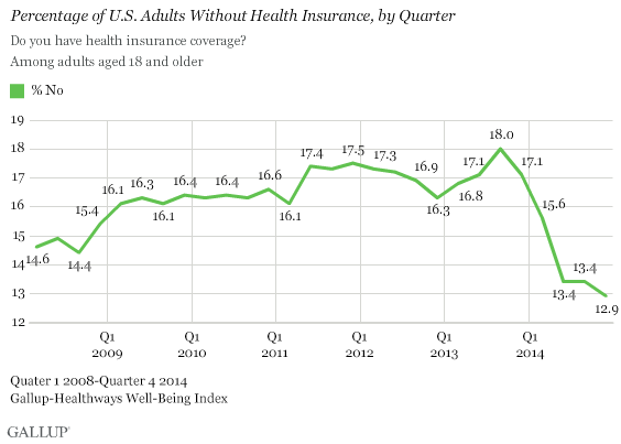
As I noted in a recent entry, Gallup-Healthways started its survey just when the Great Recession started to slam job-based benefits. 2013 was the worst year for health benefits in decades. So, Obamacare had to overcome a very low bar.
The real story of Obamacare’s effects is described in what type of coverage people have. The table shows the change in coverage for adults aged 18-64.
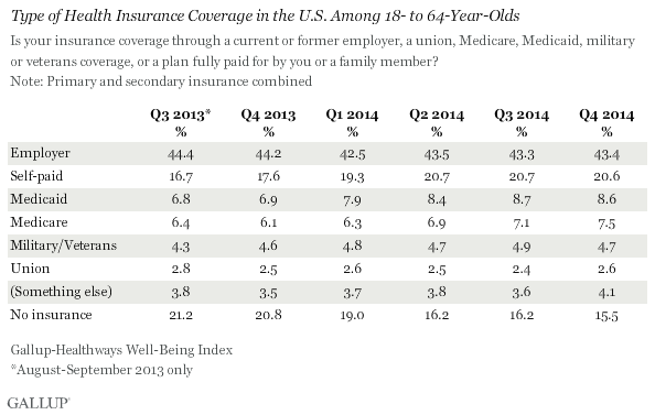
Coverage for this group increased 5.5 percentage points. But only a smidgen of that was employer-based coverage. The proportion of people dependent on the Medicaid welfare program increase by over one quarter to 8.6 percent, while the number enrolled in Medicare increased by almost one sixth to 7.5 percent. (How that occurred among those under 65 is unexplained.)
The major source of increase is those with “self-paid” coverage, which increased 3.9 percentage points. “Self-paid” is actually a misnomer, because most of these people are in Obamacare health-insurance exchanges, where almost all of them receive subsidies. The degree to which they are charity cases, like Medicaid dependents, I leave to readers to decide. But from a public-policy perspective, they are not insured like those with employer-based coverage are, because the latter pay their entire premiums themselves.


Mr. Graham:
You say: “Coverage for this group increased 5.5 percentage points. But only a smidgen of that was employer-based coverage.”
I know you are looking quarter to quarter but isn’t the more telling view year to year. In that case
— ESI is down a percent (and maybe absolutely), the same classic, predicted crowd out we saw here in Massachusetts after RomneyCare went into effect 2007-2009
— Medicaid is up a couple of percentage points as you would expect (even worse here in Massachusetts where 100,000 or so were kicked off RomneyCare insurance and put on Medicaid, which is not really insurance at least here in Massachusetts)
— Medicare among people under 65 is up dramatically — I think — because of the SSDI crisis and is not tied to PPACA in any way that I can think of (but it is still a big policy problem because the DI trust fund goes broke next year)
— Not sure what “something else” even means and why it is so relatively large since the list looks pretty exhaustive of insurance choices to me
— Note that the table measures both primary and secondary insurances, which is why the numbers add up to 106%. The Medicare inclusion, where almost everyone buys secondary and often tertiary insurance, causes part of that “extra” 6% but I don’t know what the rest is
“Something else”? I have also tried to figure that out. I cannot. Unless it actually means “I don’t know what type of coverage I have.”
As regards Medicare, we’ve seen a big uptick in people going on disability (SSDI) since 2009: http://www.richmondfed.org/publications/research/region_focus/2012/q2-3/pdf/feature3.pdf
Since it takes about two years from the time of qualifying for SSDI until you are eligible for Medicare, that might explain the increase in Medicare over the last few years.