There are lots of indicators on that site. I’m guessing that it is a combination of limiting the population in question to low income families and then looking at percentage of income spent on health insurance. I’m sure you can do that if you try hard enough
Advocates act like the sky will fall if states don’t expand Medicaid. The reality is far different: many of the uninsured will have better coverage than they would under Medicaid expansion.
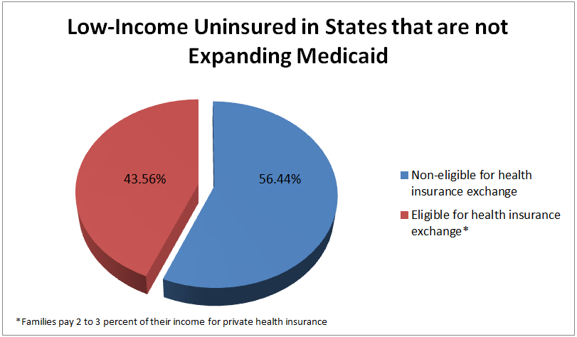


“families pay 2 to 3 percent of their income for private health insurance”
That sounds like a good number for those families.
I agree, it certainly seems manageable and reasonable.
It looks interesting, but I can’t find the actual data on the site.
It’s an amazing site. Do a little digging like Cabaret recommends.
Have you? I have and still can’t seem how this chart was gathered.
There are lots of indicators on that site. I’m guessing that it is a combination of limiting the population in question to low income families and then looking at percentage of income spent on health insurance. I’m sure you can do that if you try hard enough
Not entirely sure. I am still trying to figure out who created that pie chart. No source to be found.
And I know it has that link as the source, but that chart is not part of that study.
Like Cabaret said, it is just a certain combination of the raw data provided by KFF.
Advocates act like the sky will fall if states don’t expand Medicaid. The reality is far different: many of the uninsured will have better coverage than they would under Medicaid expansion.